


We’re sitting in the sun with Ricardo van Eyk, outside his studio. For a moment he hesitates, but then decides on the title of the exhibition: NIHIL. “The letters of the word NIHIL are like steel or aluminum girders: the I-beam/H-beam/the L profile,” a friend of Ricardo’s remarks. “Only the N isn’t. But that does, on the other hand, provide the word with a diagonal.” Writing out the title in capital letters, we muse aloud: “There is also something symmetrical about the title as an image – not quite a palindrome, although typographically it does come across as one.”
Van Eyk’s approach to using the Dutch word for ‘nil’ as a title is ambivalent: on the one hand he sees it as an objective concept with a fairly negative connotation, and on the other it’s simply a quirky word in his view – one that has a certain poetry as an image. He regards the rhythm of the letters as a composition which reveals something about the way he experiments with scale, lines and planes in his work.
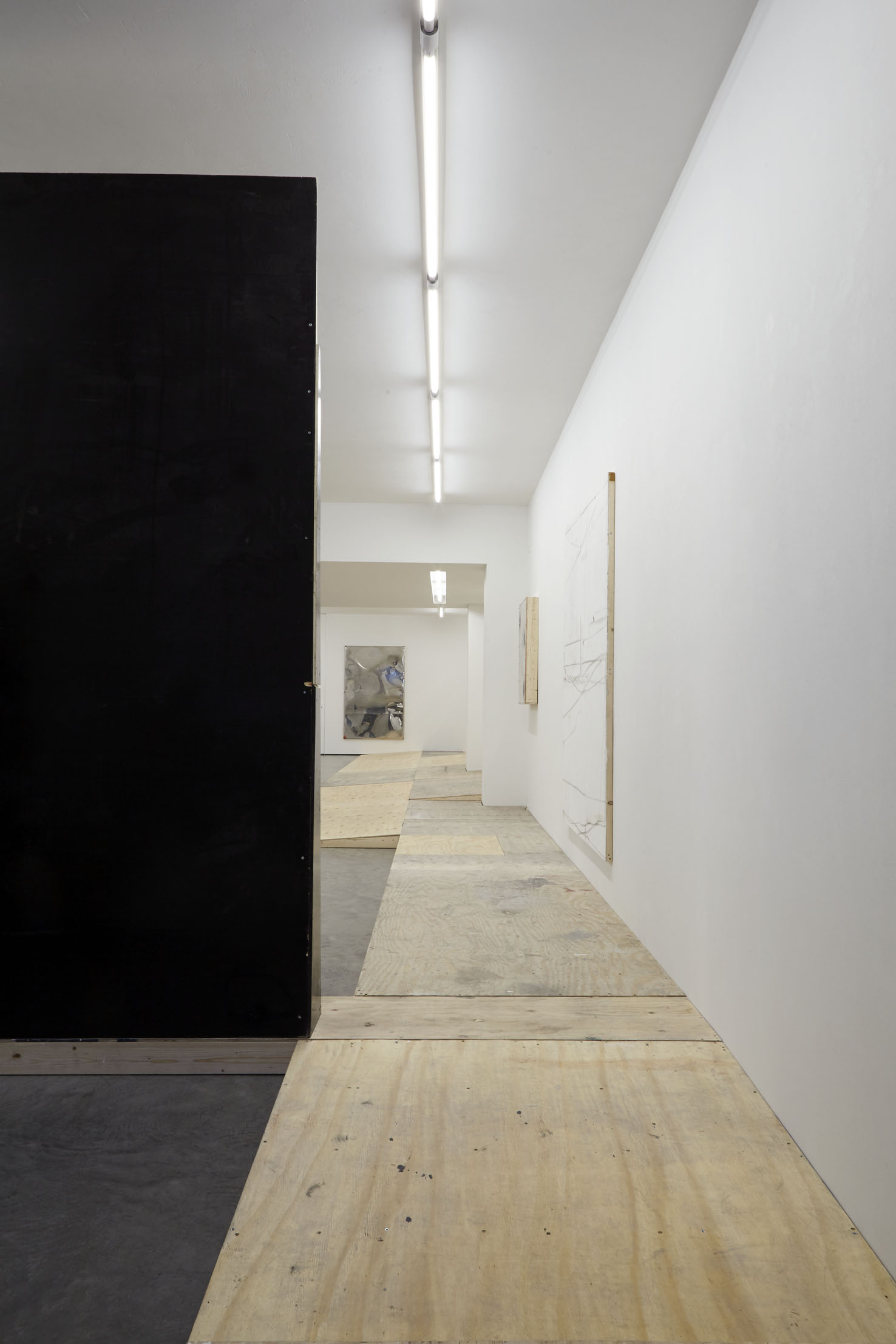
Van Eyk works on the basis of wooden constructions: boards set against each other in such a way that the sawcut line becomes a visual element, and paint applied repeatedly after being sanded away each time. The support determines the image: when making the support for the panel, the artist already decides where irregular surfaces are, where literal depth can be seen, where a shadow is cast, where slight texture picks up light or where a sawcut line remains open. In the image that ultimately takes shape, those irregularities – the result of his initial decisions during the preparatory process – actually become the main visual motif.
In his book on painting titled Great Temptations. The seduction of painting. (ROMA, Amsterdam, 2019), former director of De Ateliers Dominic van den Boogerd wrote a beautiful essay about the work of Ricardo van Eyk. “This individual hallmark of Van Eyk, as I interpret it, has to do with a kind of hidden violence. In his work, painting means manhandling the surface, a form of mutilation. The painting is broken up into individual components, fragmented, and once it is reassembled, it appears wounded or damaged. The drilling, cutting, scratching, carving and chipping of the layer of paint betrays a vandalistic toughness that Van Eyk needs in order to create something of extraordinary tenderness.”
That characteristic combination of vandalism and tenderness is beautifully expressed in his series of ‘Raw Film’ works. There the surface is determined by defects in the construction of the supporting framework, such as irregularities, holes for screws and sawcut lines. The hiding of those defects with putty and the sanding of the surface, which is then painted over again with latex, are employed as painterly play. The black line drawings in his ‘Raw Film’ works were made with rubber wheels from scaffolding, which leave dark tracks under the weight and size of this when put in the brake position. Those indirect drawings are sometimes reminiscent of ephemeral tracks made by airplanes in a cloudless sky, while other works sooner have a mathematical or architectonic look due to straight lines and geometric forms.
NIHIL takes a shot at the frequently heard supposition that Van Eyk’s work is minimalistic. NIHIL, literally meaning ‘nothing’, is even less than minimal; and for Van Eyk that’s an amusing setup. The association with minimalism, and thus with the dogma of modernism, is not entirely unjustified where his work is concerned. But actually his work is rooted, above all, in the practical and stylized forms of minimalism that we see around us on city streets: the bus shelters, the cable boxes, street furniture. Moreover, a poster for a Chanel advertisement can just as easily be a source of inspiration for Van Eyk. He regards himself as a painter. His work has evolved from a special eye for the urban environment as a continually changing system, for the way in which the city functions as a ‘support’ for traces of human presence, the passing of time and signs of decay. These visible traces of human presence function as a point of departure for his paintings and installations, which are sometimes referred to as ‘in-between architecture’.
In the new work being shown, a true ‘Van Eyk installation’ allows us to see that the developmental process of the paintings has become increasingly complex: it is a reinvention of painting in terms of material and thought, while the ultimate image always displays concentrated simplicity. So don’t hesitate: come see NIHIL!